Method note
How expert data is verified before it is sold
Mono kicker, serif title, dated line
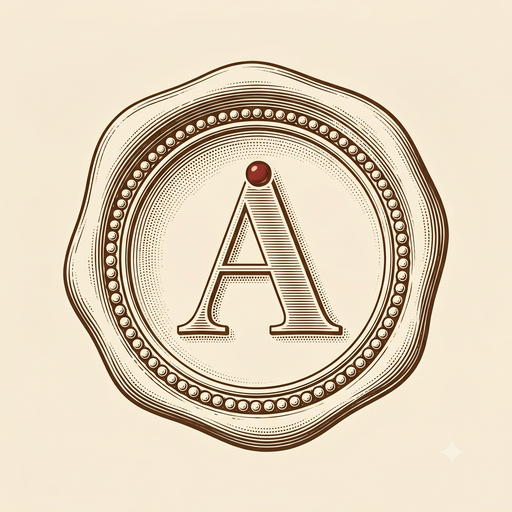 ARCA
Concept 01 / 03
ARCA
Concept 01 / 03
ARCA · design concept 01 · the archive
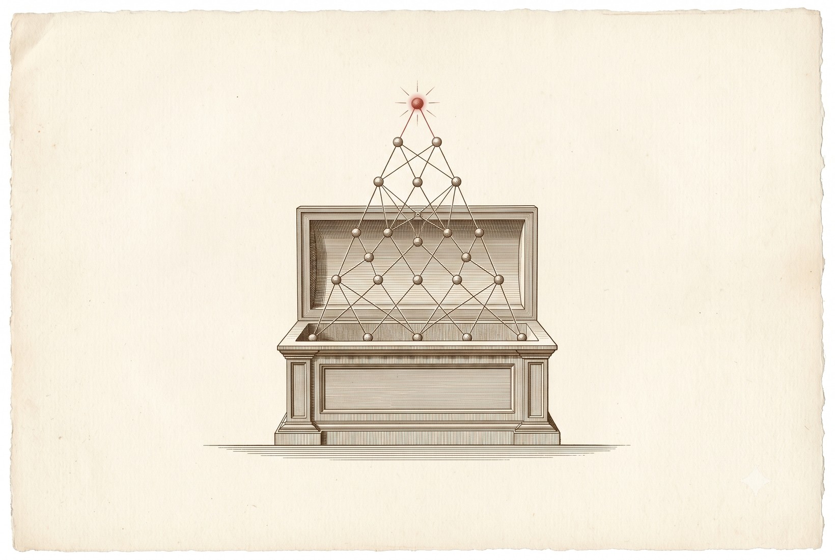
This is the first of three visual directions for ARCA. It dresses a marketplace for rare expert data in the language of an old archive: fine serifs, etched plates, printed-ink color. The wager is simple. Data this scarce should feel like it is being kept, not scraped.
Arca is Latin for chest, coffer, and ark. It is the root of the word archive, and the source of arcane: the hidden thing kept inside a chest. The product is a bonded store of data that only domain experts can produce, opened and made legible to the labs that need it. The name already carries the whole idea, so the identity does not have to shout it.
A marketplace for rare knowledge should feel like a place where rare knowledge has always been kept.
This is why the direction does not reach for the usual AI look of black screens and neon accents. It reaches further back, to the printed page, the engraved plate, the catalogue of a serious collection. Those are the places where scarce knowledge has been recorded with care for centuries, and that inheritance is exactly the feeling a buyer should have when they arrive: this is kept, verified, and worth paying for. Nobody in AI is building in this register, which is the second reason to do it.
Every choice below is in service of one feeling: fine, kept, and credible. Here is what was chosen, and why.
ARCA's growth engine is not advertising, it is research and writing, the way these markets are actually won. So the brand ships a publication. This module, modelled on a journal's contents page, is where benchmarks, method notes, and contributor dispatches live. It is also the design reason for an editorial system in the first place.
A marketplace has two audiences, so the page has two doors. Experts are courted first, because supply is the constraint. Labs follow, drawn by the same seriousness.
Get paid for the knowledge only you can produce. Set your terms, keep your provenance.
Apply to the archive →Buy verified, expert-made datasets you cannot scrape or synthesize. Provenance included.
Request access →On motion: it stays restrained. Sections settle with a slow fade as you scroll, and the hero plate draws itself in once, the way an etching appears under the needle. Nothing bounces or parallaxes. The craft is meant to live in the typesetting, not the animation.